Workflow: How scientists are decoding what the past smelled like
Explaining my workflow within the CNN Art Department for any aspiring editorial illustrators or designers in my network.
This was a fascinating project that combined my passions for archaeology, history, science, photography, design and animation direction.
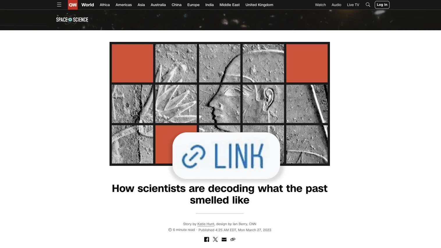
As always my process starts on a dropbox paper document where I drop in references, links, concepts and all the things I come across in my research of the subject matter. These documents live in the cloud and are easily shared amongst all of the project’s stakeholders and is a great place to inspire the team and receive feedback in real time for different aspects of what I’m pitching visually. In this case, the first draft hadn’t been outlined so I had an opportunity to help shape the story with visuals I found interesting such as the amazing looking chromotographs which are used to analyze sometimes microscopic organic residues and determine what substances make up the particular smell.
Motion Designer Patrick Gallagher, was instrumental in helping me realize this versatile animated Adobe After Effects template for Katie Hunt’s fascinating reporting. Along with a sketch over a photo, a gif from a 1966 episode of “Star Trek,” and my verbal art direction that went “you know, make it a loop that looks beee-boooop-baap” resulted in a styling I used variations of across multiple science stories from the series.
The final step is to import everything into a figma template and from there I can see an accurate preview of how the published story will feel and I can make any final edits and adjustments to crops and sizing taking the whole page into account. Figma has a really nice feature that allows you to easily share a url for the prototype which makes it easy to pitch to stakeholders the pacing of graphic elements to text and communicate that suggested layout as well as any interactive elements to developers and editors for the final build in the content management system.